ePrint Instructions
How to Use Cowboy Data Round-Up
Cowboy Data Round-Up (CDR) has significantly increased the availability of data to the university community. End users now have the ability to interact with dashboards to obtain the information needed for their specific constituents.
The public dashboard category does not require a login to access dashboards. All other dashboard categories will require a login. Access to non-public dashboards should not be shared with individuals outside the university community.
- Logging in to Cowboy Data Round-Up

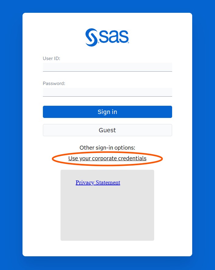
To log in, click the "Use your corporate credentials" link. Do not enter your OKEY information on the blue SAS login page. After clicking the "Use your corporate credentials" link, you will be directed to a Microsoft login page where you will enter your OKEY information.
If you are already logged in to an OSU system, such as my.okstate.edu, you will not receive a login prompt after clicking the "Use your corporate credentials" link.
- Accessing Dashboards from an Off-Campus LocationTo access Cowboy Data Round-Up dashboards that require login from an off-campus location, you must log in to the OSU VPN service.
-
Navigating Dashboards
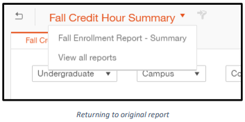
Table of Contents pages are included on many dashboards. Links on this page will take you to pages within the same dashboard or to other dashboards. Should a link take you to a different dashboard you can always navigate back to the original using the drop down menu or the icon in the top left corner.
Page Tabs allow you to move from page to page within a dashboard. You can also use the icon to the right of the page tabs to move between pages.
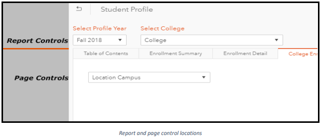
- Report and Page Controls
There are several different ways a dashboard can be filtered. Report controls filter the entire dashboard with the specified selection and are located above the page tabs. Page controls filter only the information on the page and are located below the page tabs.
- Prompt Menus
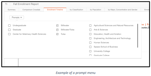
Another useful tool for filtering a dashboard is a prompt menu. These are generally located in the page control section of the dashboard. Prompt menus can contain many different categories that can be selected to filter a dashboard. It is important to be aware of prompts that may or may not be selected when you are viewing a dashboard.
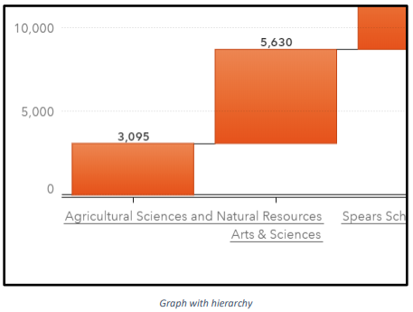
- Hierarchies
Within graphs, hierarchies are a tool that allows the user to click on a label to access more detailed information. Generally, if a label on a graph is underlined a hierarchy is available for selection.
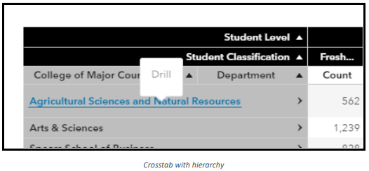
Crosstabs can also contain hierarchies. If a crosstab has > in a row label, a hierarchy is present. You can click on the > to expand the hierarchy or click on the row label to drill down and show only the information in the next level of the hierarchy for that particular value.
- Graph-to-Graph Filtering
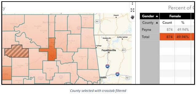
Some graphs may filter other graphs. This is not always apparent on a dashboard. Be aware that clicking a particular data item within a graph may change the output of another graph on the page. An example of this is when a map and crosstab are displayed on a page. Selecting a location on the map may filter the crosstab.
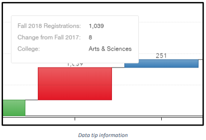
- Data Tips
More information about a specific value on a graph may be available within the data tip. To access this information, hover your mouse pointer over the item on the graph.
- Expanding Dashboard Graphs and TablesAll objects in a dashboard can be expanded to fill the entire page. To do this, click the icon in the upper right corner of the object. You can do the same for the entire dashboard by clicking the icon in the upper right corner. Expanding a dashboard object will also allow you to see a list table of the data displayed in the object.
- Printing or Downloading Dashboards
To print a dashboard, select the icon in the top right corner. A “Print to PDF” pop-up will appear where you will be able to select options for your print job. The second tab on the pop-up menu will allow you to select specific object for your print job.